Bundled Experience Design System
My Role
Lead Designer / Column Lead
Team
Designers across 5 product teams, and governance supported by a design lead and producer.
Summary
Five product teams designing similar flows independently created inconsistent patterns and duplicated work. I led the creation of a shared component library and governance model to align teams and reduce rework.
Impact
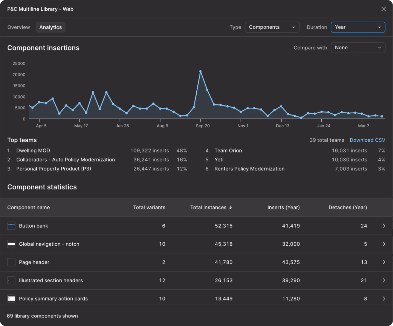
260K+ Component inserts across 6 teams (2025)
39% Reduction in design and compliance defects
40+ Teams reference the library as a model
This is not a story about pushing pixels (even though that was part of this journey). This is a story of bias for action, collaboration, and leadership.
The Problem
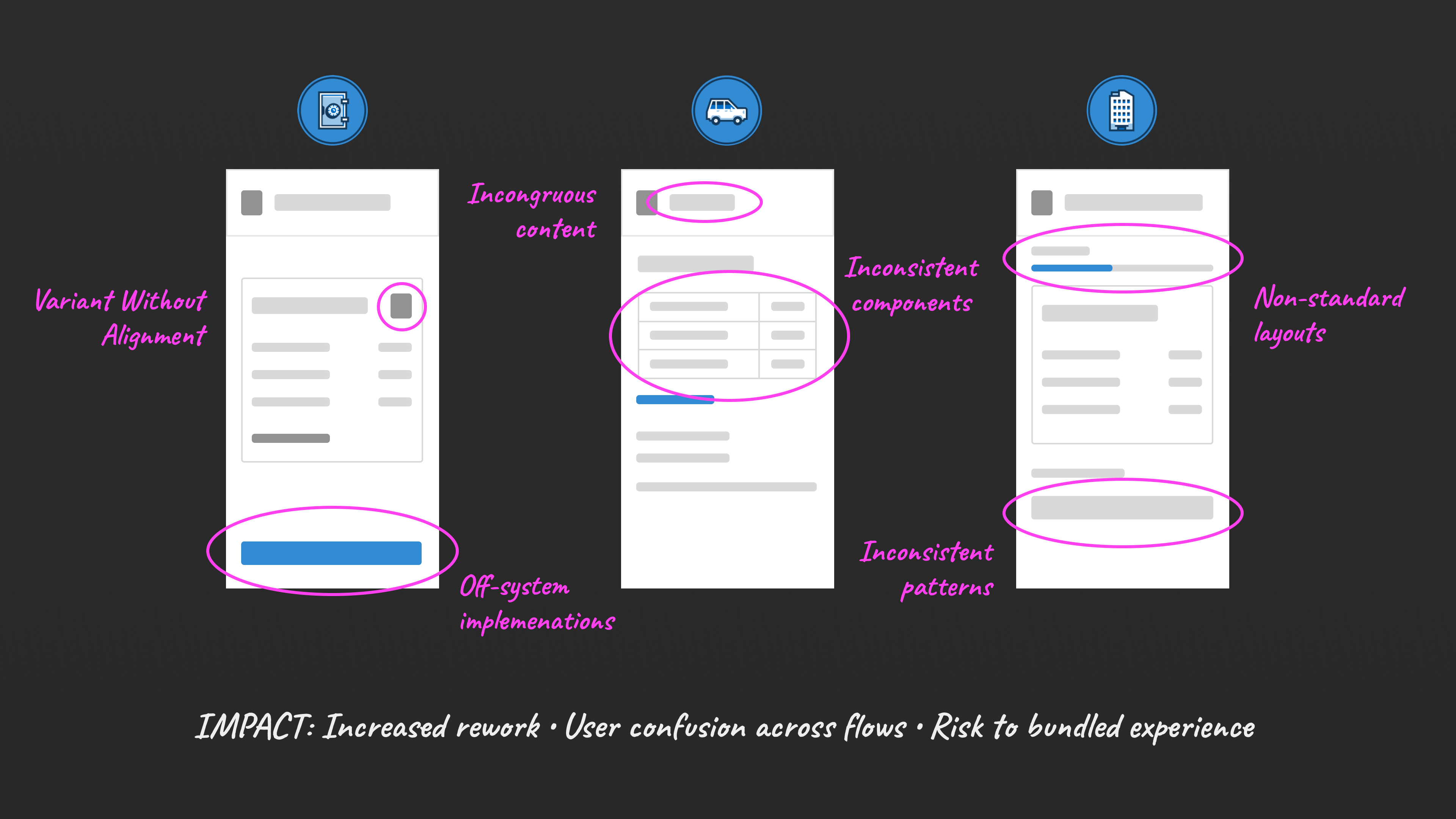
As USAA modernized its Property and Casualty quoting experiences, 5 product teams were independently designing similar quote flows across both new purchases and complex policy changes. This work was happening ahead of a broader multi-product quoting initiative (bundling) aimed at unifying these flows into a single experience, but it didn't address how teams would stay aligned while building independently. As a result:
- Inconsistent patterns emerged across products (e.g., information display, status messaging, entry and exit interactions)
- No mechanism existed to propagate updates, creating high coordination overhead and manual duplication
- Teams repeatedly solved the same problems, leading to unnecessary rework
- "First-to-implement" patterns were adopted by default — even when they didn't scale
- Increased risk of accessibility, compliance, and design system gaps
Without alignment, these flows risked breaking the bundled experience before it was even built.
Opportunity
To support bundled experiences at scale, teams needed a shared system that:
- Aligns experiences on critical UX patterns
- Reduces duplication and rework
- Bridges the enterprise design system with real product needs
- Enables seamless multi-product quoting experiences
Solution
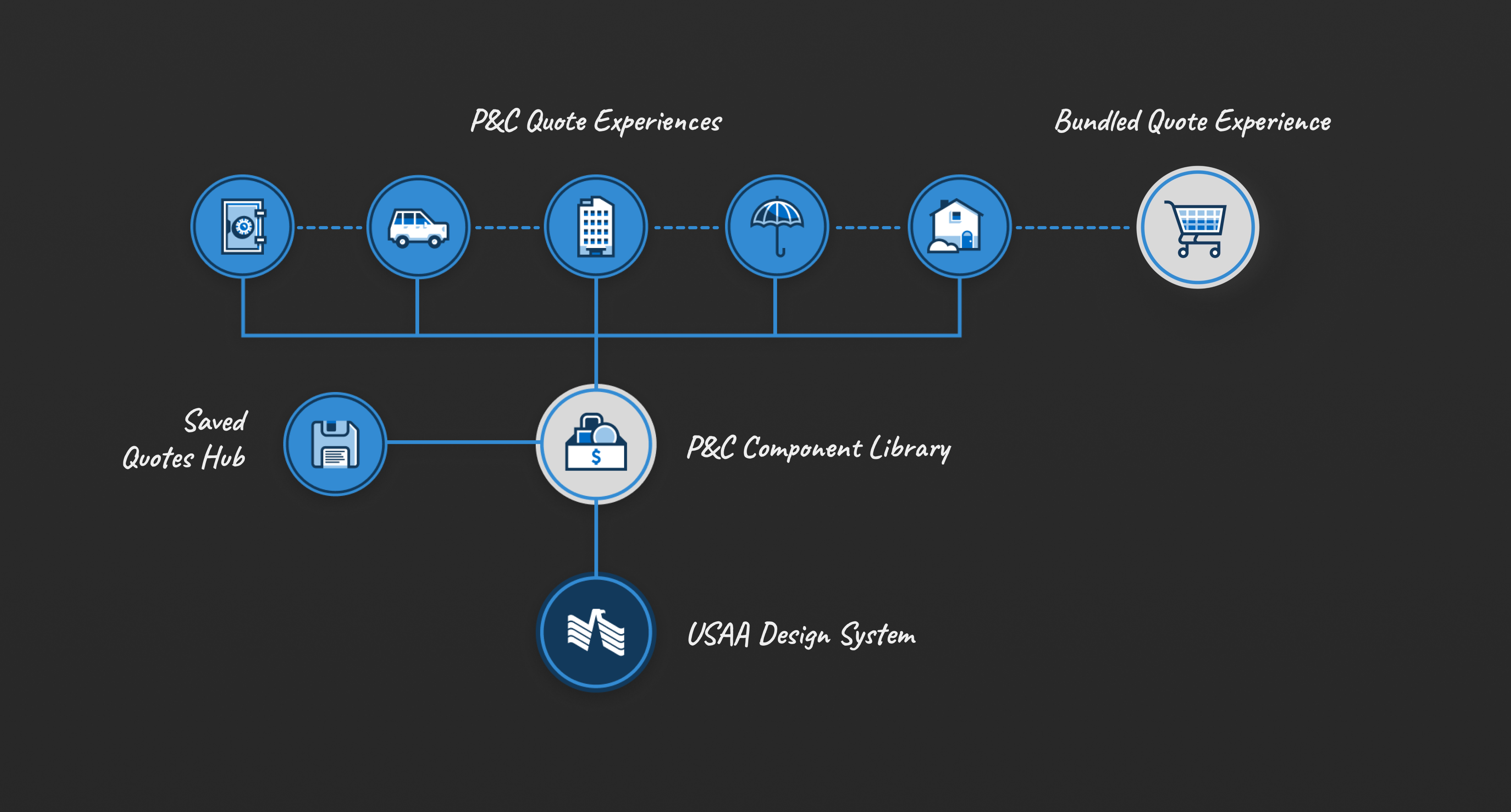
As the lead of the cross-product Saved Quotes Hub initiative, I had a unique vantage point across teams and began to notice gaps in alignment. Building on my experience with Figma and scalable systems, I kicked off a cross-team effort to address this through a shared component library and operating model. What began as an individual initiative evolved into an official workstream with representatives from each product. This system enabled teams to move independently while staying aligned, ensuring their work could integrate seamlessly into the bundled experience.
1. Shared System Foundation
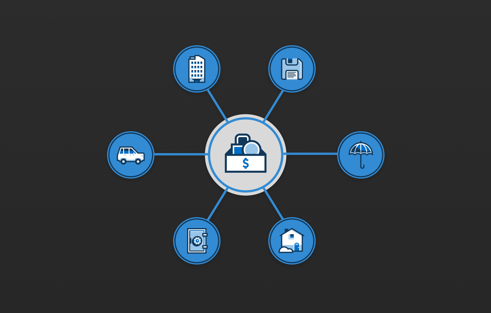
I created a centralized library built on top of the enterprise design system that:
- Standardized component configurations, content, layout, and behaviors
- Extended the enterprise design system for P&C specific needs
- Stored new shared patterns and custom components not covered by the core system
- Documented best practices for adding and publishing new components,
This evolved into a shared source of truth for single and multi-product quote experiences, including 69 components, 9 templates, and 7 patterns — with accessibility considerations and usage guidelines.
2. Driving Alignment and Adoption
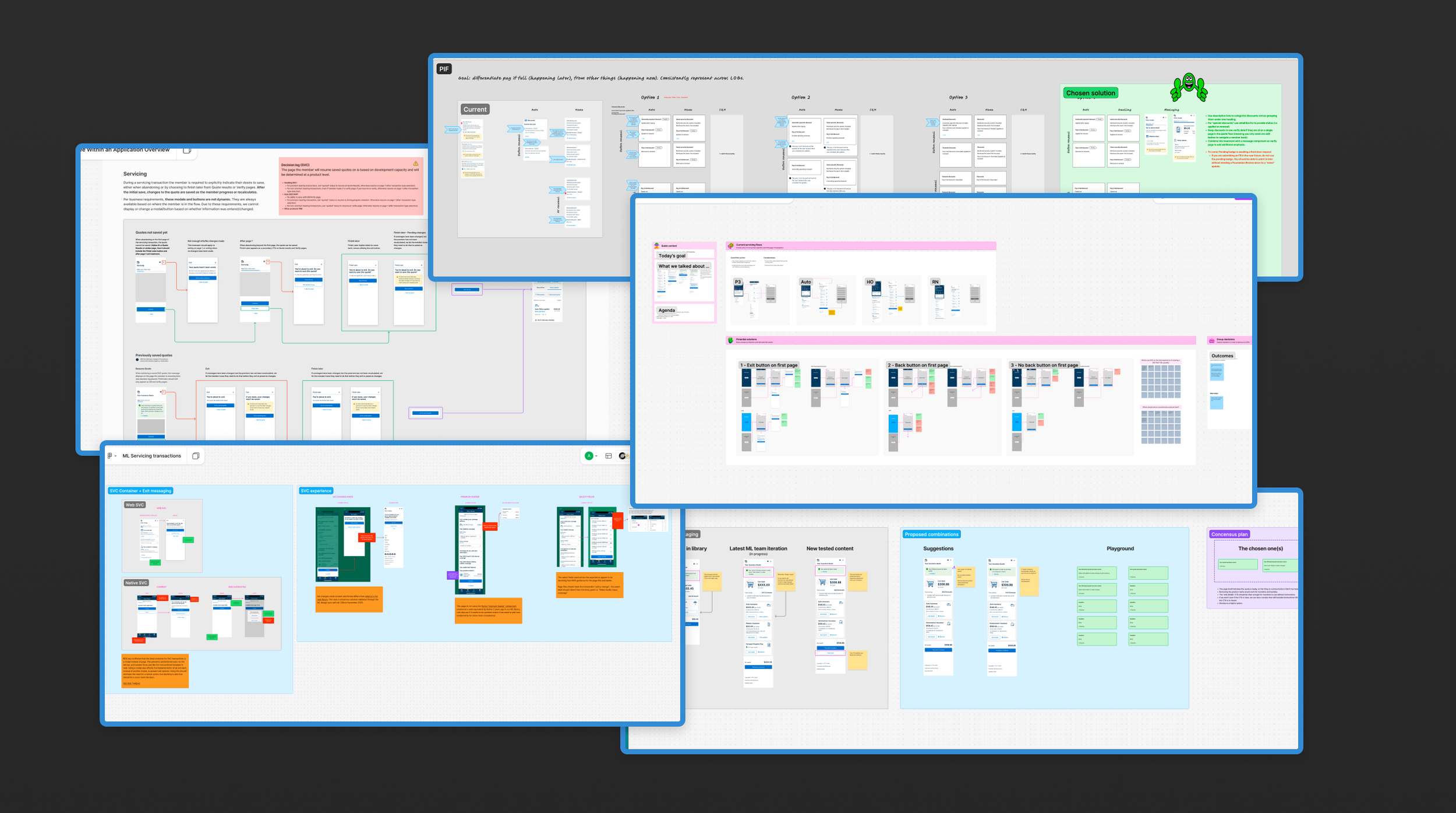
I kicked off a series of cross-team workshops, bringing together 30–40 designers, directors, and product stakeholders to define shared approaches for key scenarios such as:
- Entry and exit behaviors in quote flows
- Save and resume experiences
- Status and error messaging
- Handling policy changes and edge cases
Through these efforts, I helped shift the group toward a shared ownership model, increasing participation and cross-team alignment. Now, instead of patterns being defined by the first team to implement them, teams brought ideas into cross-team syncs early where we validated them across products before implementation. Once aligned, patterns were added to the shared library so teams started from a common solution, updates propagated automatically, and rework was avoided. This shifted the organization from reactive alignment to proactive, system-driven consistency.
3. Governance & Scaling the System
As the system gained traction, the effort was formalized into an official cross-team workstream, expanding to a team of 10 with representation across all products. To ensure the system could scale sustainably, I helped establish a governance model that defined how patterns were introduced, reviewed, and maintained across teams. This included:
- A structured intake model for new components and patterns
- Review processes to ensure alignment with design systems, accessibility, and compliance
- Changelogs to improve visibility and transparency of decisions
- Bi-weekly working sessions to evaluate additions and evolve the system
As ownership transitioned to a design lead and producer, I continued to play a key role in shaping system direction, driving contributions, and maintaining cross-team alignment. These efforts led to a 39% reduction in design and compliance defects across the 6 product teams.
4. Leveraging Figma to Enable Scale
As USAA was onboarding to Figma, I became a go-to resource for structuring libraries at scale. I introduced layered libraries (org → cross-team → product) through presentations and lunch-and-learns for hundreds of designers and developers. This approach allowed teams to preserve connections to the org or team level libraries while standardizing content and configurations for specific needs, speeding up iterating and updates across single and multi-file projects. These practices also benefitted handoff, ensuring consistency carried through implementation. As a result, 40+ teams across USAA have referenced the Bundled experience library as a model for their own projects.
Impact
By the numbers
- 260K+ component inserts across 6 teams (2025)
- Referenced by 40+ teams as a model for cross-team systems
- 38% reduction in design and compliance defects across P&C
- Personally originated 43%+ of library updates and enhancements (2025)
- Led 34% of cross-team alignment topics (2025)
Strategic impact
- Enabled seamless multi-product quoting by aligning independently built flows ahead of bundled integration
- Reduced rework and coordination overhead across teams
- Eliminated "first-to-implement" bias through shared decision-making
- Enabled automatic propagation of improvements through shared components
- Helped operationalize a major multi-product initiative by enabling cross-team consistency at scale
Reflection
This work shifted my role from designing individual experiences to shaping how teams design at scale. By identifying a gap in a major initiative and driving alignment without formal ownership, I helped ensure independently built experiences could integrate into a cohesive product, and established a system that scaled beyond my immediate team.